WHY AM I BEING ASKED TO
SUPPLY VECTOR ARTWORK
Quick Answer: To ensure best print quality for your logo on any promotional item.
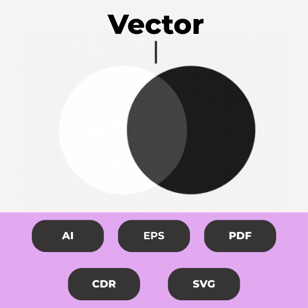
Think of vector artwork like a superhero version of your logo. Unlike PNGs or JPGs (which are made of tiny pixels), vector files use mathematical lines and shapes. That means you can make your logo as big as a billboard without it getting blurry or grainy. You can change colours, resize it, or tweak text effortlessly. Perfect for printing perfection!
More Detail:
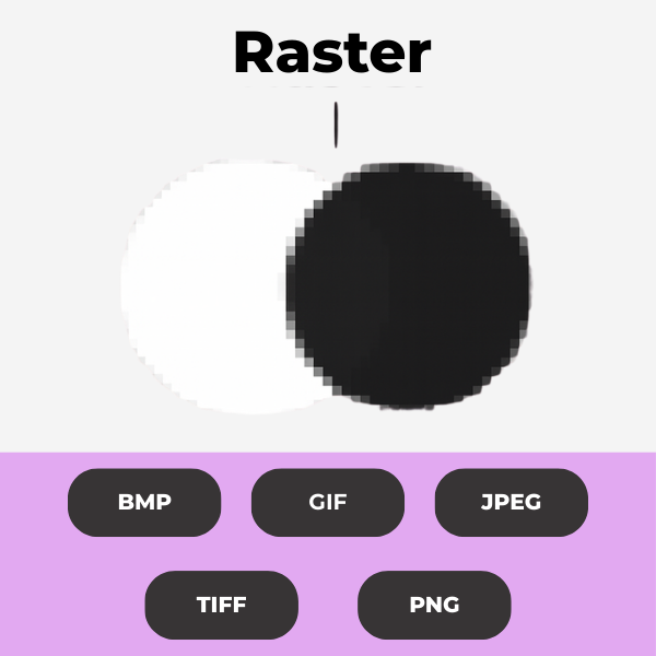
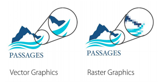
Vector art is essential for creating sharp, scalable logos, text and designs, as it is composed of paths rather than pixels, allowing for resizing without quality loss, unlike raster graphics which become pixelated when enlarged. Common vector formats like those from Adobe Illustrator, CorelDraw or high-resolution PDF’s ensure high-quality prints at any size, the quality will look the same on a business card as it will on a billboard.
Raster formats like JPEG embedded in EPS files are unsuitable for printing and often require redrawing.
Logo Redraws: We offer a fast and cost effective redraw service. Please submit your artwork so we can provide a quote.
Unfortunately, JPEG files saved in an EPS format can’t be used. Once a file has been in a JPEG format, it is not possible to revert that process. This also goes for any JPEG’s embedded into a vector file.
To maintain integrity, all fonts should be converted to outlines, and font names and PMS colours should be provided alongside artwork files, ensuring consistent and accurate reproduction across various mediums.
ARTWORK GUIDELINES
To ensure your artwork fits all the previously highlighted criteria, we recommend following the guidelines below for vector art.
- Save fonts as ‘Outlines’ in Illustrator or ‘Export as Curves’ when using CorelDraw. This will turn your fonts into vector and ensure there is no corruption when sharing files.
- Fonts not outlined or exported as curves will not print properly. Fonts, spacing, and/or shaping often change when using a file when this step is not applied.
- We recommend using CorelDraw or Adobe Illustrator to create your art. Save files as EPS (Encapsulated PostScript) files.
- Art must be 100% size.
- Scans and JPEGs saved as EPS files are generally incompatible because EPS is a vector format primarily used for illustrations and graphics; raster images like JPEGs and scans need to be converted into a suitable vector format. Artwork in this format will typically need to be redrawn.
There are several different formats and files that you will come across during the artwork process. Below are some guidelines regarding these files and formats.

ILLUSTRATOR
Text to be converted to outlines/curves so we have the correct font. Placed images to be either embedded or supplied as separate files.

COREL DRAW
Convert text to curves so we have the correct font.

PDF:
Original artwork files are preferred, but artwork can be supplied in a PDF format. Images must be high resolution (300dpi) when placed at 100%, and all text to be converted to outlines. Images must be embedded in the PDF.

FONTS:
Font Files must be supplied or converted to outlines/curves to avoid font problems.

EMBROIDERY:
Artwork for embroidery can be a high-quality JPEG file or an Illustrator EPS file with fonts converted to outline.
Branding Colours
Thread Colours – Embroidery That Matches
Embroidery uses thread colours, which vary slightly across different suppliers. But when your brand uses Pantone references, we can match embroidery threads as closely as possible. No guesswork, no surprises, no “close enough” shades.
Let your PMS colours guide the stitch-perfect match!
CMYK – For Full Colour Printing
CMYK (Cyan, Magenta, Yellow, Black) is the go-to process for full colour printing. While great for digital and offset printing, it’s not as precise for techniques like screen or pad printing. So don’t rely on it for critical brand colours.
Use CMYK for things like flyers, brochures, or digital prints.
RGB & HEX – The Digital Side of Colour
These colour systems are made for screens! RGB (Red, Green, Blue) and HEX codes are what web designers use to keep your brand looking sharp online.
Ideal for websites, social media, and anything digital, but not suitable for print.
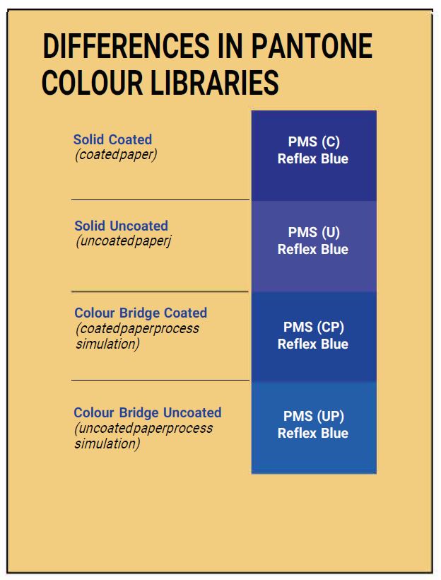
Pantone Colours – Colour Consistency, Globally
Ever seen your brand colours look different across different products? Enter the Pantone Matching System (PMS). With over 2,000 standardised colours, Pantone makes sure your green is your
green. whether it’s printed in Melbourne or Madrid.
Most commonly used in Screen printing, Dye sublimation, and Pad printing.
What are PMS Colours
(Pantone Matching System)
Use this guide to assist your colour selection for printing.
This chart is a reference guide only. Pantone colours on computer screens may vary based on the monitor set up.
The artwork, as it appears on your computer screen is almost certainly not accurate. Here’s just a few of the reasons why:
- All computer screen or device renders colour differently.
- On-screen proof is using a totally different method of creating colour than a printed piece, and some on-screen colours are actually impossible to reproduce in four-colour printing.
- Even different programs on the same computer can render colour differently.
- Home printers are not accurately calibrated for colour and may vary wildly.
- The paper you are using is likely different than the substrate you intend to print on and may have different reflective qualities.
- You may notice a major shift in colours as your ink cartridges and toners cartridges ages.
PMS Stands for Pantone Matching System.
The Pantone Matching System is a standardised colour communication tool used globally by designers, manufacturers, and brands to ensure colour consistency across various stages of production, from conception to final printing. It facilitates precise matching of colours in applications like pad printing and screen printing, making it essential for maintaining brand integrity.
PMS can be used to match thread colours for embroidery.
If you know your PMS colours, sharing this information with your logo ensures accurate reproduction; otherwise, referencing the PMS chart helps you select the closest colour match for your needs.
A Little History about The PANTONE Matching System
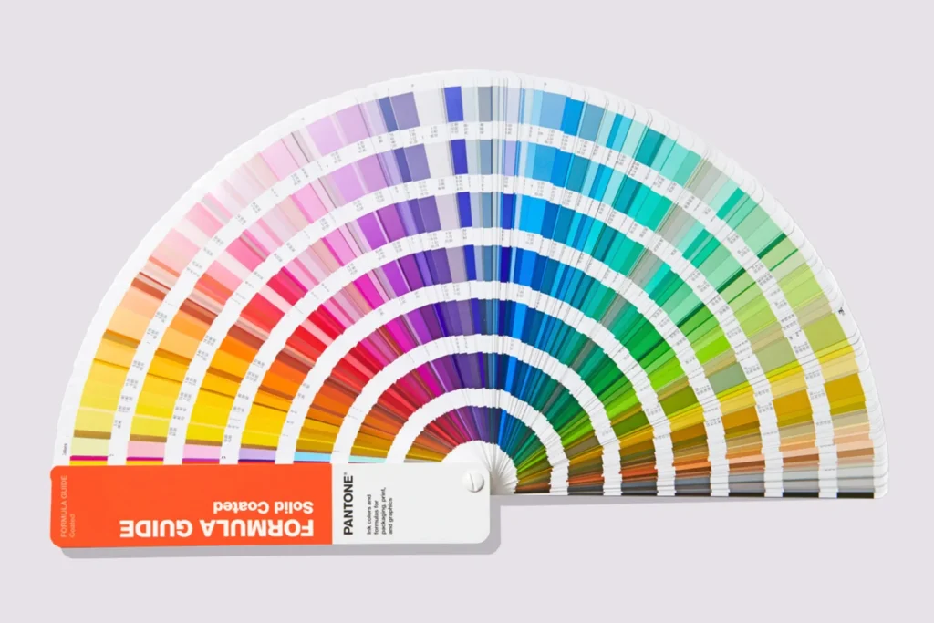
The Pantone Matching System was created by Lawrence Herbel in 1963 in order to solve the problems associated with producing accurate and consistent colours by creating standardized colours of ink through detailed measurements and ink mixing. One of the biggest advantages in using specific Pantone colours in your digital files is the colour reproduction will be identical every time you print. This is how a company such as coca cola can produce the exact red (PMS 75-1) in their logo for example, no matter which printing company they use.
The Pantone Matching System (PMS) system uses pre-determined, published colour formulas to create a large number of ink colours. Similar to the paint swatch guides you find at your favourite paint store, the pantone colour chart contains thousands of colour swatches created from a palette of basic colours. Creating a Pantone spot colour is similar to mixing paint such as blue and yellow to get green, but with much more precision. Each colour has a ‘PMS’ number assigned to it. These numbers are used to identify the exact colour needed. The specified ink is then prepared using the correct mixture of base colours, either purchased pre-mixed from an ink company or mixed on-site at the printing company. Using PMS inks is called spot colour printing.
Colour is very subjective, which is why the Pantone Matching System works so well. It takes all the guesswork out of colour identification. Every computer monitor is different; every printer is different. By standardising the colours, manufacturers and customers in different locations can all refer to the Pantone system to make sure colours match. It is used by many printers and graphic artists to deliver reliable, reproducible colours to their customers. The ink manufacturers who create the base colour inks are strictly licensed by Pantone for colour accuracy.